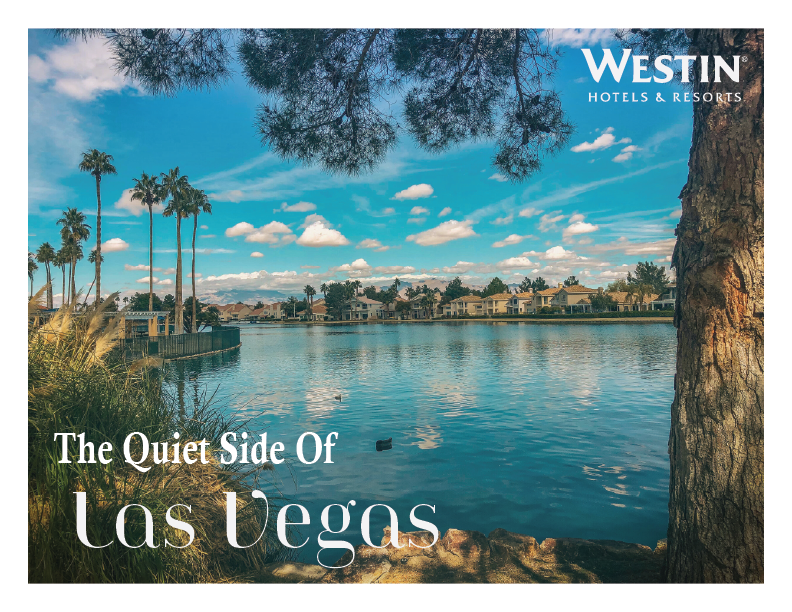
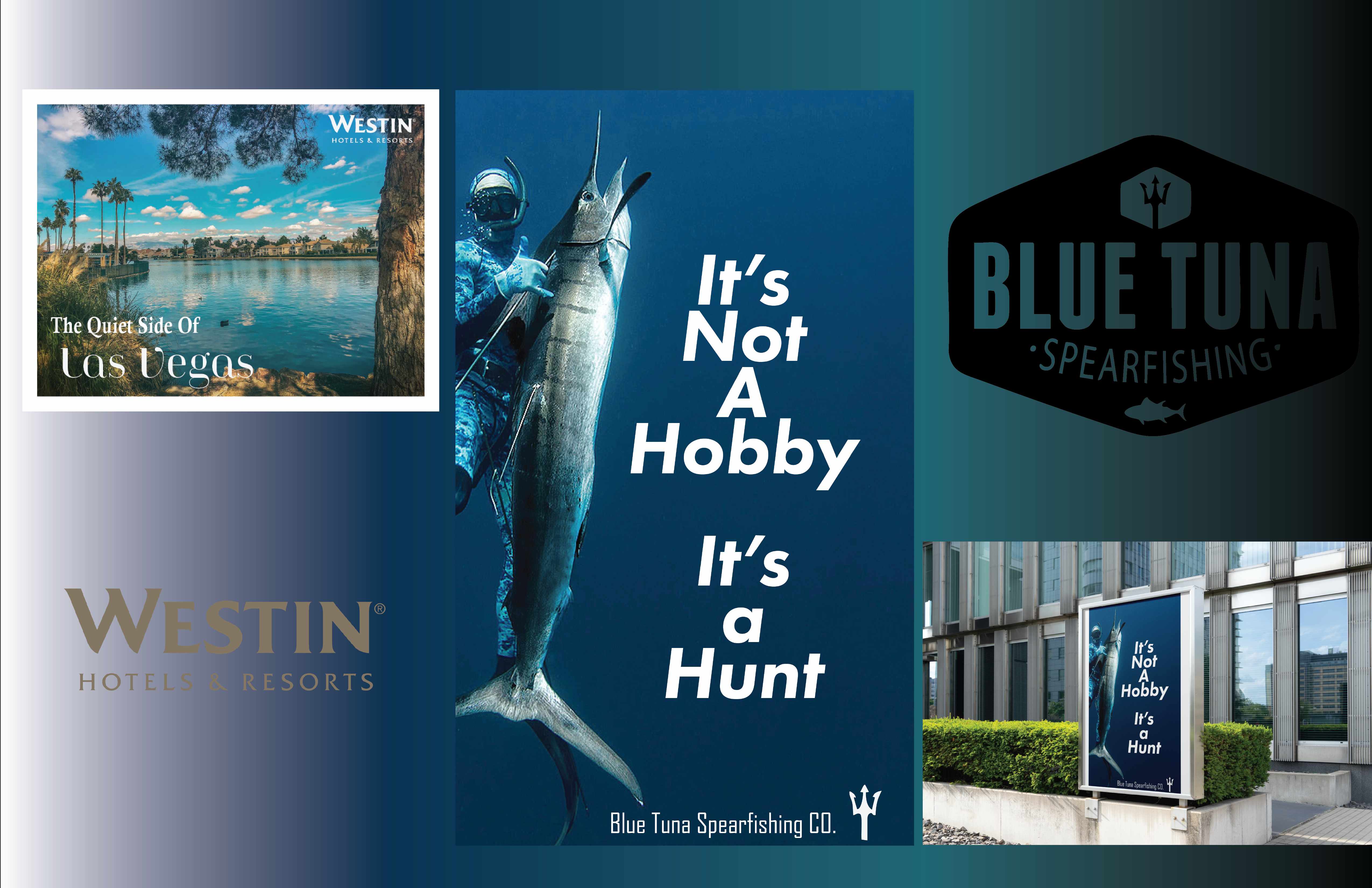
The Quiet Side
of Las Vegas.
Westin | Second Year | Brand Campaign | ADBR 252
Repositioning the Westin Lake Las Vegas as the antidote to the sensory overload of the Strip.
The Project
This campaign repositions the Westin Lake Las Vegas Resort & Spa as the antidote to the sensory overload of the Strip. Set against a 350-acre man-made lake just 17 miles away, the tagline The Quiet Side of Las Vegas draws a clear contrast between the chaos of the city and the serenity of the resort. The postcard format evokes the classic tradition of sharing travel moments — positioning the Westin as a destination worth writing home about.
The Challenge
Market a Las Vegas resort to travelers who are not chasing neon and slot machines — convincing wellness-focused guests there is a calmer side to a city famous for excess.
The Insight
Not everyone who visits Las Vegas wants the Strip. Some are seeking silence, nature, and genuine relaxation. Positioning against the chaos creates a clear value proposition without criticizing competitors.
The Direction
Where the visual language was set — mood, tone, and the creative territory the campaign would live in.
The Groundwork
Research, references, and early exploration that shaped the strategic thinking before any design began.
The Process
Sketches, iterations, and the working decisions that moved the idea forward.
The Build
Refining concepts into polished, production-ready directions.
The Work
The finished campaign across every touchpoint.
The Full Deck
The complete project presentation, start to finish.