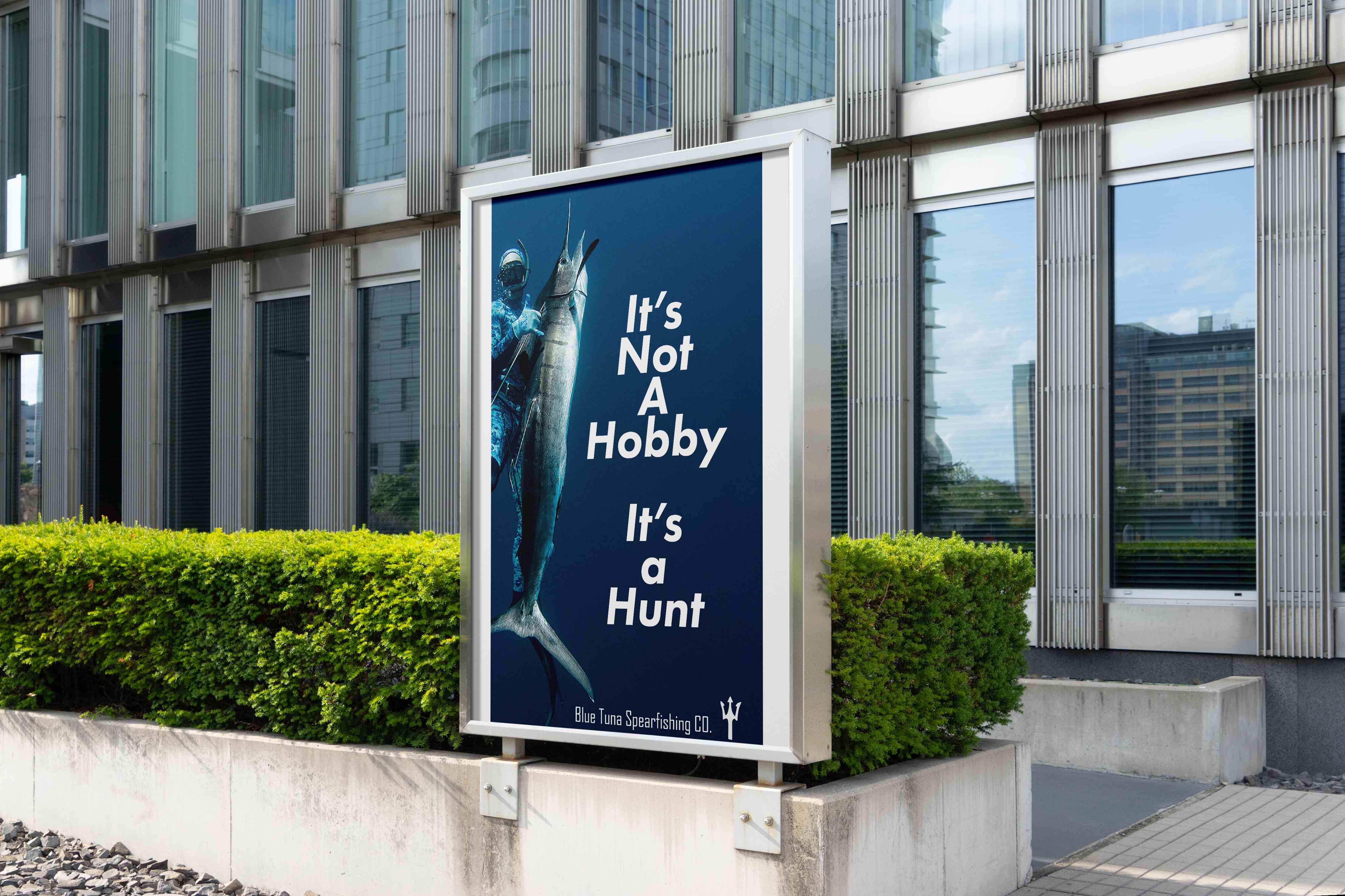
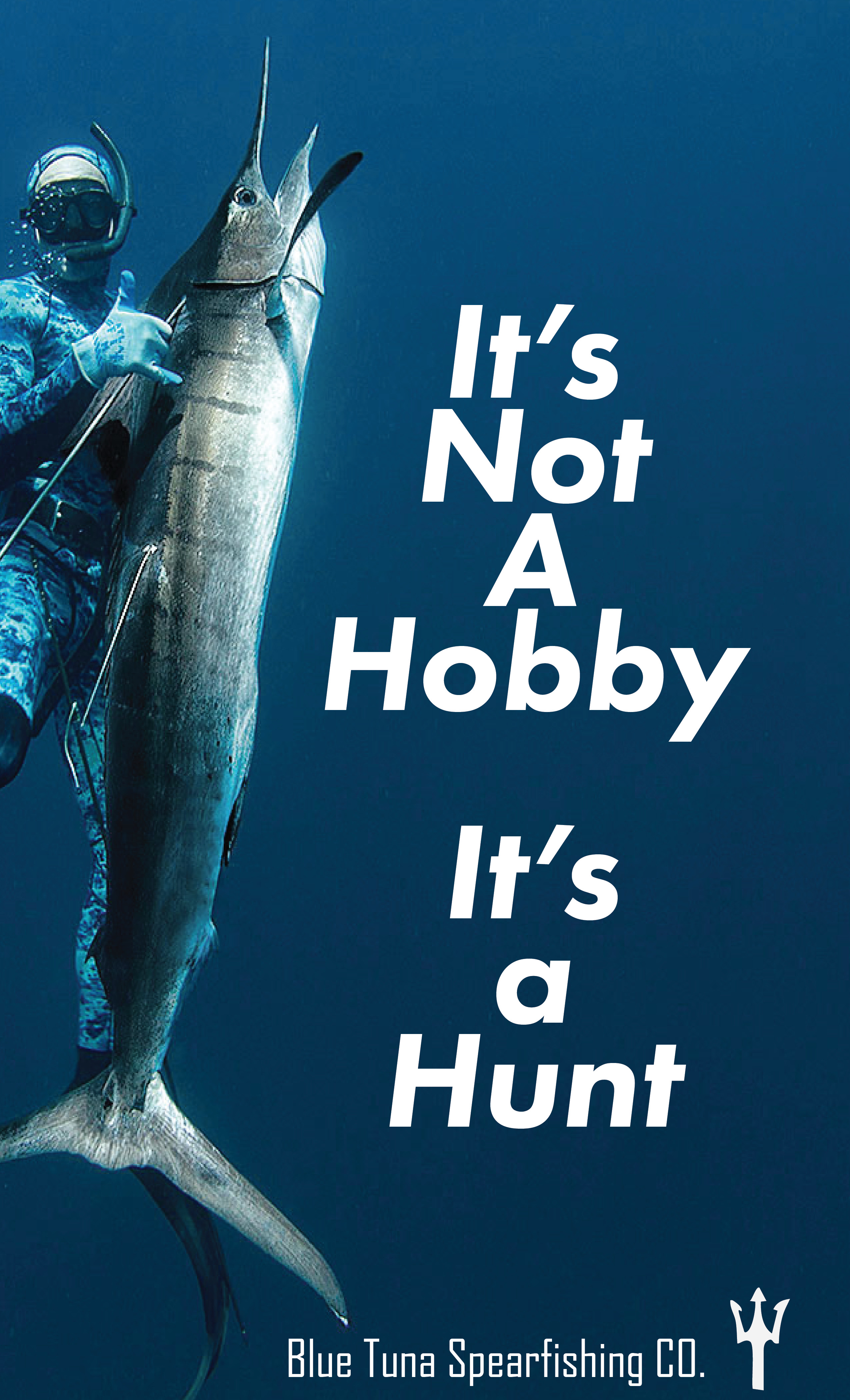
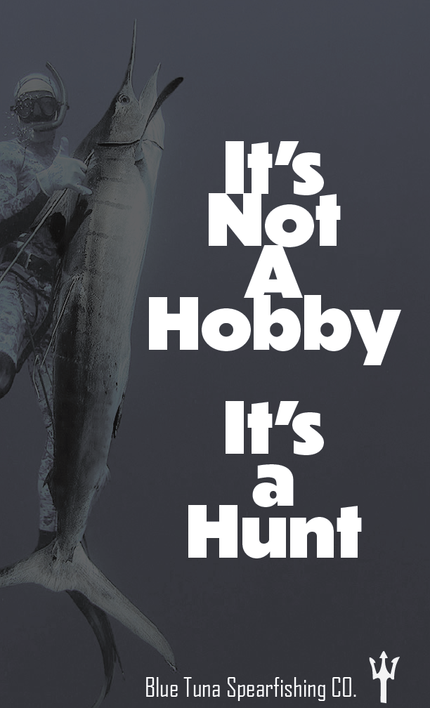
It's Not A Hobby,
It's a Hunt
ADVERTISING / OOH — ART DIRECTION — ADBR 252
A bold OOH campaign capturing the raw, primal essence of spearfishing.
The Project
This campaign for Blue Tuna Spearfishing CO. captures the raw, primal essence of spearfishing as more than a recreational activity — it's a hunt. Founded in 2008 in Ventura, California, Blue Tuna empowers spearfishing and freediving enthusiasts with high-quality gear and a deep respect for the ocean.
The Challenge
Blue Tuna serves a niche, self-reliant audience of spearfishers and freedivers. The campaign needed to feel authentic to that subculture while still landing with the broader human desire for challenge and adventure — all in an outdoor format that has to read in a single glance.
The Insight
Spearfishing isn't a pastime to its community — it's a hunt. Leaning into that primal positioning let the work tap into something universal: the pull of challenge, self-reliance, and the wild.
The Direction
Where the visual language was set — mood, tone, and the creative territory the campaign would live in.
The Groundwork
Research, references, and early exploration that shaped the strategic thinking before any design began.
Research Assets & Moodboards
Add research, references, and moodboards here.
The Process
Sketches, iterations, and the working decisions that moved the idea forward.
Sketches & Process Work
Add sketches and in-progress process work here.
The Build
Refining concepts into polished, production-ready directions.
Development Assets
Add development and refinement assets here.
The Work
The finished campaign across every touchpoint.
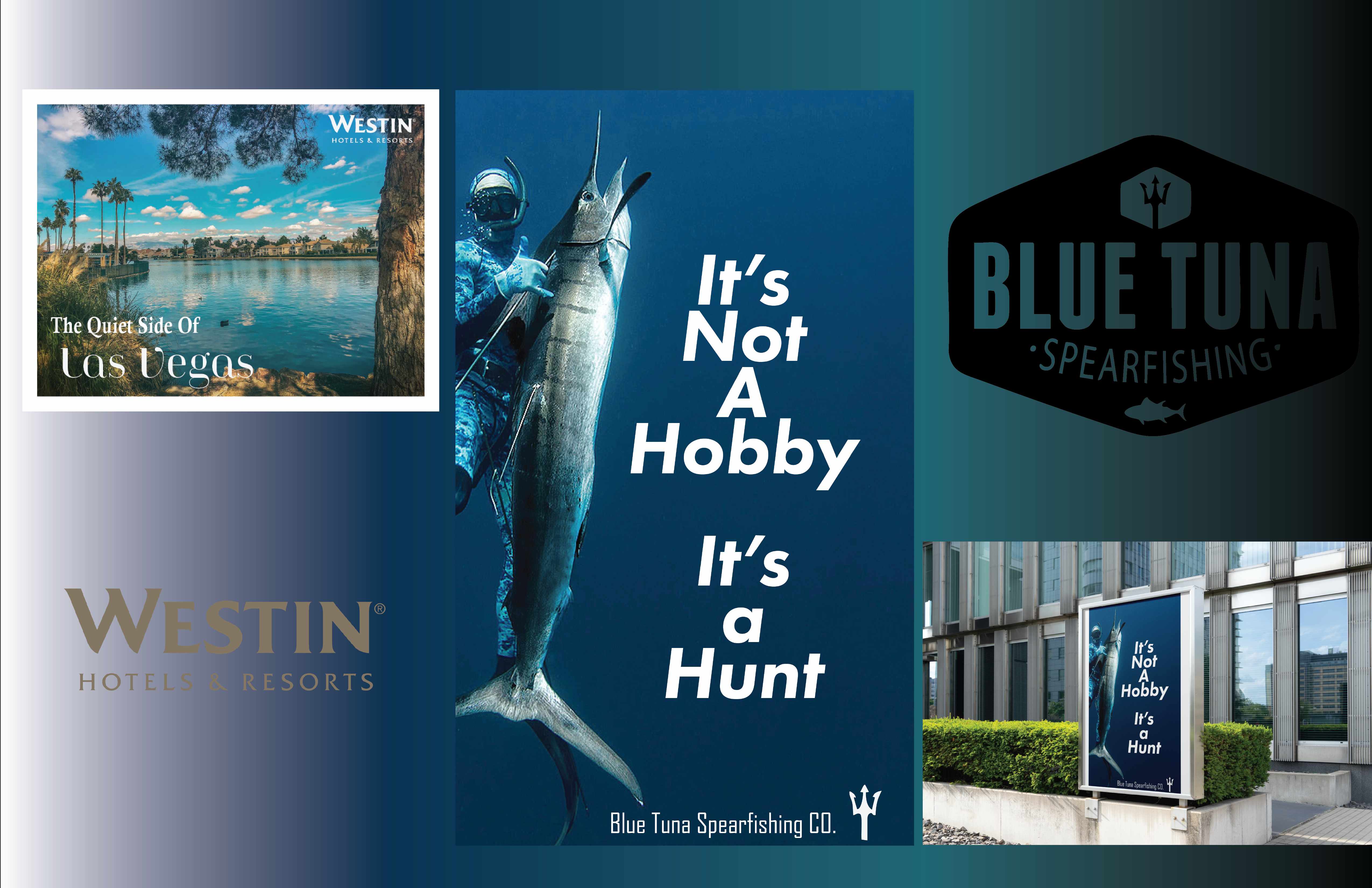
The Full Deck
The complete project presentation, start to finish.