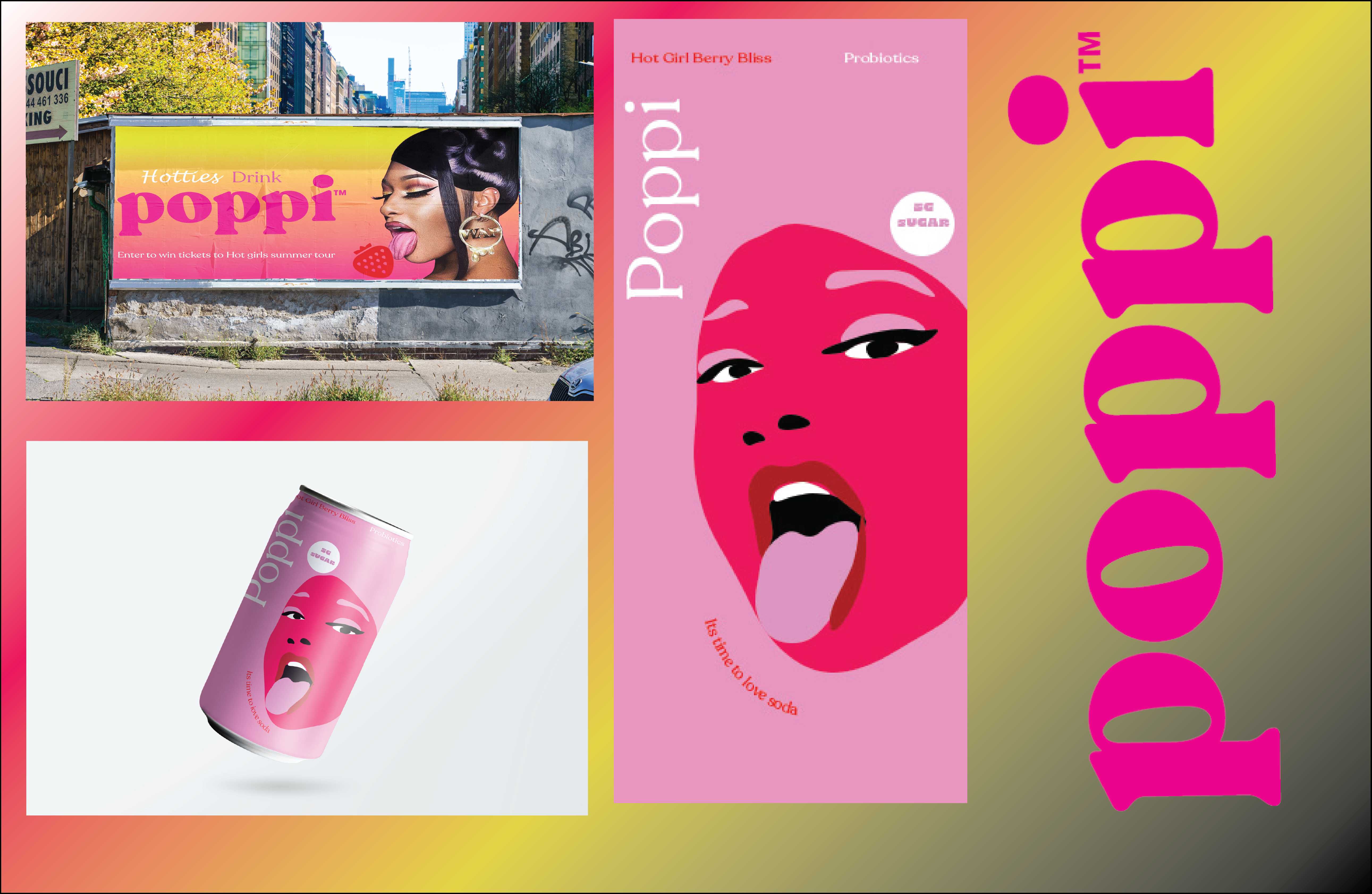
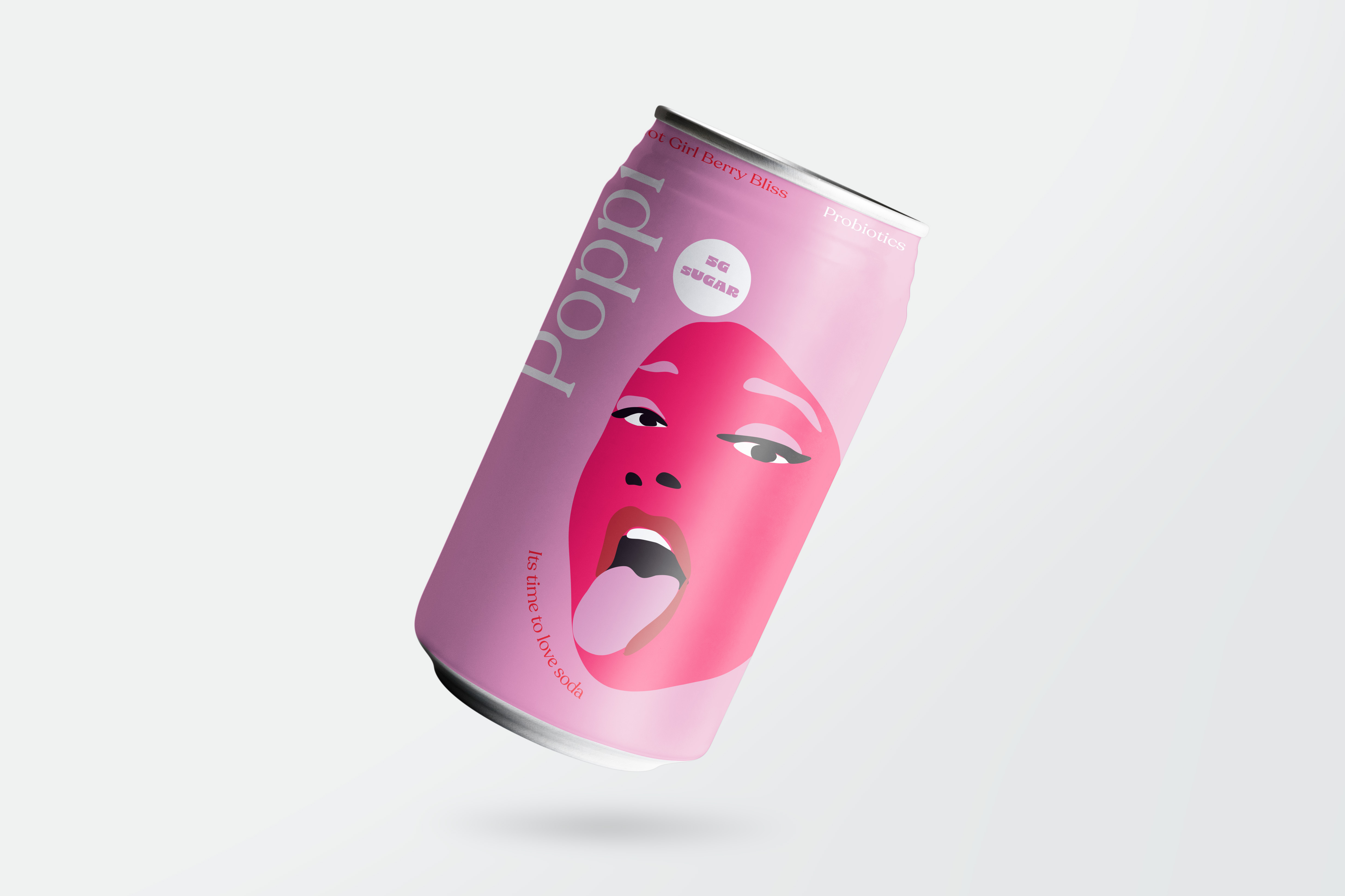
It's Time to
Love Soda.
Poppi | Second Year | Branding & Packaging | ADBR 252
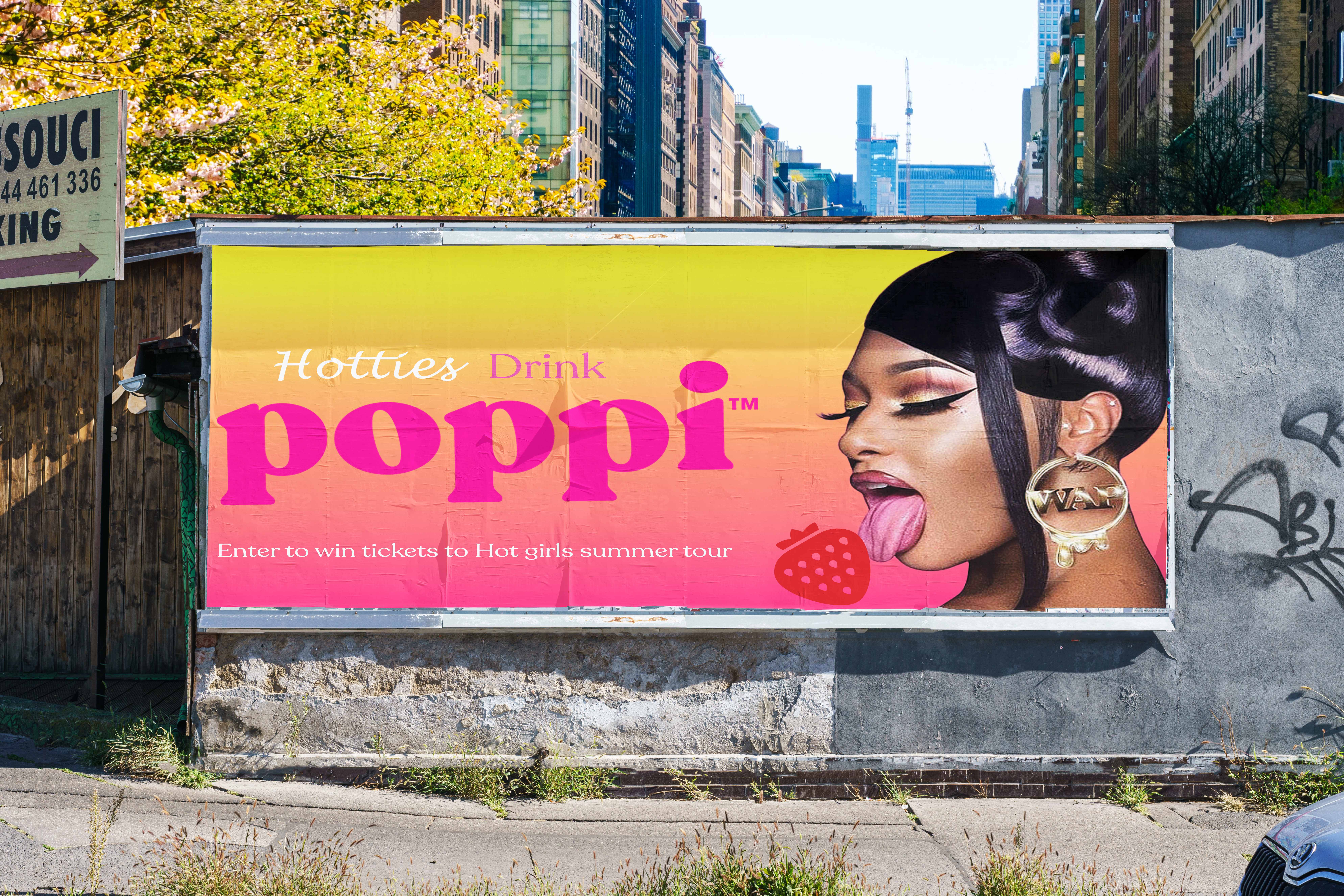
A limited-edition flavour concept — Hot Girl Berry Bliss — that positions Poppi as the drink of a bold, confident generation.
The Project
This campaign for Poppi — the probiotic soda brand — introduces a limited-edition flavour concept, Hot Girl Berry Bliss. Tapping into pop culture and the energy of the Hot Girl Summer movement, the campaign positions Poppi as the drink of choice for a bold, confident generation. The tagline It's time to love soda reframes the category, inviting consumers to embrace a healthier alternative without sacrificing attitude.
The Challenge
Differentiate Poppi in a health-drink category that often feels clinical, and give a limited flavour drop enough cultural energy to feel social and shareable.
The Insight
Confidence sells. By tying the brand to the Hot Girl Summer movement and a bold illustrated face, Poppi becomes an attitude, not just a beverage.
The Direction
Where the visual language was set — mood, tone, and the creative territory the campaign would live in.
The Groundwork
Research, references, and early exploration that shaped the strategic thinking before any design began.
The Process
Sketches, iterations, and the working decisions that moved the idea forward.
The Build
Refining concepts into polished, production-ready directions.
The Work
The finished campaign across every touchpoint.
The Full Deck
The complete project presentation, start to finish.